A Poster
About
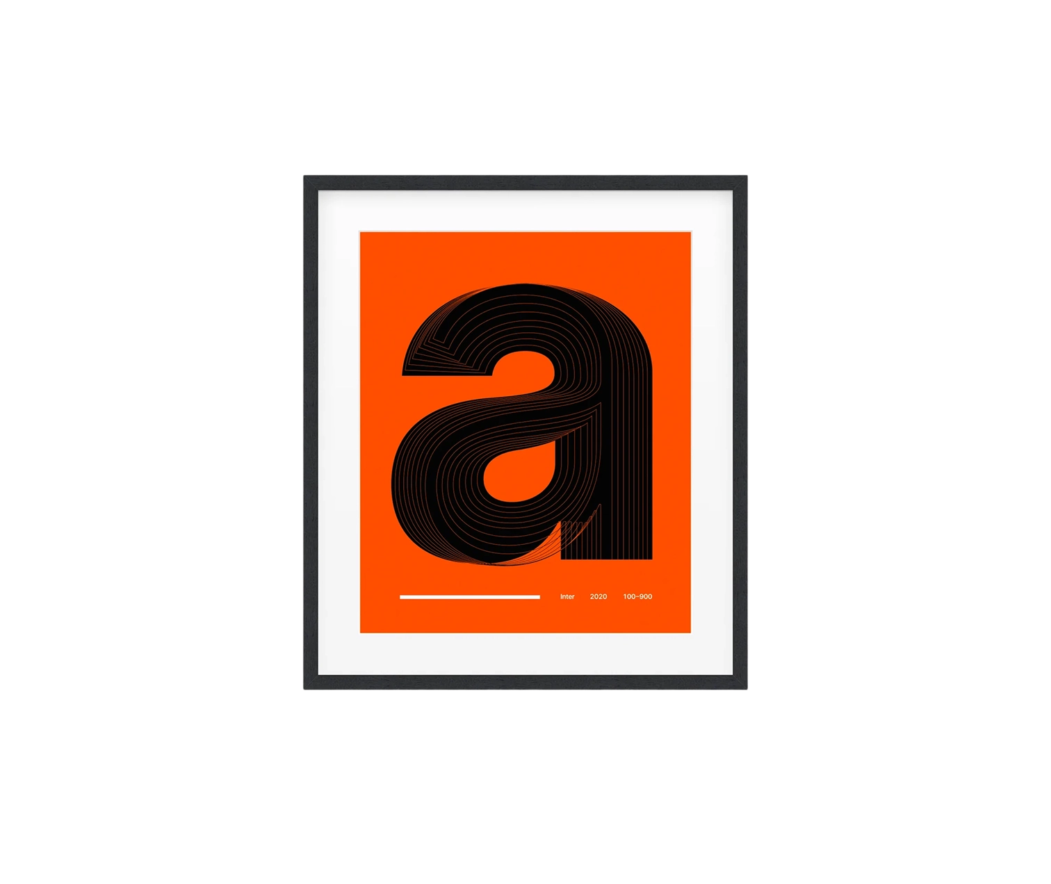
Typography reveals its secrets slowly. Most observers register fonts as background elements, processing words without examining the shapes that compose them. This poster invites closer study, isolating a single lowercase letter and displaying its transformation across the full weight spectrum of Inter, the open-source typeface designed by Rasmus Andersson.
Spanning weights from hairline thin at 100 through bold darkness at 900, the composition documents how a character evolves as mass accumulates. Counter spaces compress, stroke contrast shifts, and curve tensions adjust, all the subtle calibrations that distinguish professional type design from amateur lettering. What appears simple on screen becomes a meditation on the craft required to maintain legibility and personality across such varied applications.
The print itself receives equal consideration. Giclée reproduction on 189 g/m² museum-quality matte stock ensures ink saturation without surface sheen, allowing blacks to achieve their deepest values while fine details remain crisp at any viewing distance. The non-reflective finish means the poster works equally well under gallery lighting or next to a window, never competing with ambient glare.
For designers, developers, and anyone who has ever adjusted letter-spacing or debated serif versus sans, this piece speaks a familiar language. Hung in a studio, office, or living space, it signals an appreciation for the invisible labor that makes reading effortless.