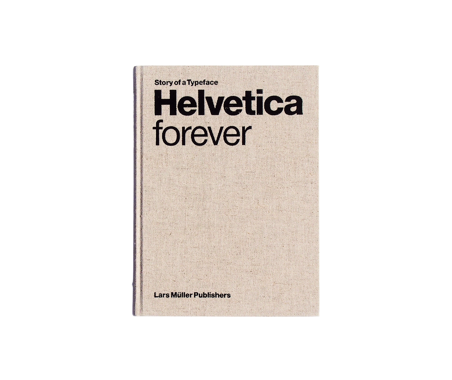
Helvetica Forever
About
Few typefaces have achieved the ubiquity and influence of Helvetica, and Gestalten's volume traces the arc from its 1957 creation at the Haas foundry in Switzerland through decades of global proliferation across transit systems, corporate identities, government communications, and cultural institutions. The book examines how a set of letterforms designed for neutrality and clarity became perhaps the most recognized typographic system in the world.
The historical narrative begins with Max Miedinger and Eduard Hoffmann's original drawings, contextualizing their work within the broader Swiss design movement that valued rationality, grid-based organization, and visual restraint. Archival materials including original specimen sheets, early applications, and contemporary posters document the typeface's initial reception and gradual adoption. As Helvetica spread beyond Switzerland, particularly after licensing to American foundries, the book traces its integration into the visual fabric of cities, corporations, and countercultures alike.
Interviews with designers, typographers, and critics provide varied perspectives on what Helvetica represents and why it endures. Some view it as the ultimate expression of modernist ideals, while others critique its dominance as homogenizing. These conversations illuminate broader questions about how typeface choice communicates values and shapes perception, making the book relevant beyond historical documentation.
Gestalten's production presents the material thoughtfully, with reproduction quality that honors the archival images and typography that appropriately defers to the subject matter. For graphic designers, the volume functions as both reference and inspiration. For those outside the profession, it offers an accessible entry into understanding how something as seemingly simple as letter shapes carries cultural meaning and aesthetic consequence. A thorough examination of how form becomes language.